Conditionals – Making Choices
So we want to show that the data is "cooked". This could be done lots of ways but we will do it graphically to show our supervisor.
Objectives
- Write conditional statements including
if,elif, andelsebranches. - Correctly evaluate expressions containing
andandor. - Correctly write and interpret code containing nested loops and conditionals.
We will use much of what we have done in previous lessons, so lets start by importing the libraries we will use.
import glob

import numpy as np
import matplotlib.pyplot as plt

%matplotlib inline
Now we want to read all the files, and calculate the overall statistics for each file. So we simplify our analyze function to calculate, not plot the statistics
def analyze_stats(filename):
    data = np.loadtxt(fname=filename, delimiter=',')
    return data.mean(0), data.max(0), data.min(0)
We will now set up the large arrays that we will store the statistics in. We use some other methods for creating numpy arrays: * empty() * empty_like()
Also available are: zeros(), zeros_like, ones(), and ones_like().
datalen = 40
filenames = glob.glob('inflammation*.csv')
nofiles = len(filenames)
datamin = np.empty((nofiles, datalen))
datamean = np.empty_like(datamin)
datamax = np.empty_like(datamin)
Similar to the previous lesson we interate over the files and calculate the statistics for all those files. However, we want to store the information, so we count the files and use that as an index into the file. Note that datamean[count] is actually a vector, one value for each time.
Python (and most other languages in the C family) provides in-place operators, for example:
count += 1to add 1 to count.
count = 0
for f in filenames:
    datamean[count], datamax[count], datamin[count] = analyze_stats(f)
    count += 1
However, this is a bit awkward. Can't we just get python to "count" as it loops through the files. Yes, we can using enumerate.
for count, f in enumerate(filenames):
    datamean[count], datamax[count], datamin[count] = analyze_stats(f)
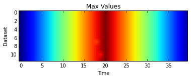
Plotting a heat map, like in the first lesson, of the maximum values shows one statistic we is think totally unrealistic for real data.
plt.imshow(datamax)
plt.xlabel('Time')
plt.ylabel('Dataset')
plt.title('Max Values')
plt.show()
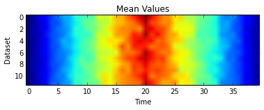
However, the mean is perhaps not quite as clear
plt.imshow(datamean)
plt.xlabel('Time')
plt.ylabel('Dataset')
plt.title('Mean Values')
plt.show()
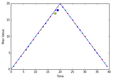
So, we will use line plots to show:
- that the overall maximum is a simple straight line up and straight line back down with the same slope,
- that almost ALL the time the maximum of a dataset is equal to the overall maximum at that time, and
- those two maximum values that are not equal to the overall maximum are exactly one less than it
To do this we will use a conditional statement, imbedded inside loops.
overallmax = datamax.max(0)
plt.plot(overallmax)

for count in range(nofiles):
    for time in range(datalen):
        if datamax[count,time] - overallmax[time] == -1:
            plt.plot(time, datamax[count, time], 's')
        elif datamax[count,time] < overallmax[time]:
            plt.plot(time, datamax[count, time], 'x')
        else:
            plt.plot(time, datamax[count, time], '.')

plt.xlabel('Time')
plt.ylabel('Max Value')
plt.show()
One important thing to notice the code above is that we use a double equals sign == to test for equality rather than a single equals sign because the latter is used to mean assignment. This convention was inherited from C, and while many other programming languages work the same way, it does take a bit of getting used to...
We can also combine tests using and and or. and is only true if both parts are true:
if (1 > 0) and (-1 > 0):
    print 'both parts are true'
else:
    print 'one part is not true'
one part is not true
while or is true if either part is true:
if (1 < 0) or ('left' < 'right'):
    print 'at least one test is true'
at least one test is true
In this case, "either" means "either or both", not "either one or the other but not both".
So, let's put this all in function called sherlock() and a second function plot_clues():
def sherlock(filenames, datalen=40):
    datamax = np.empty((len(filenames), datalen))
    for count, f in enumerate(filenames):
        datamax[count] = analyze_stats(f)[1]
    plot_clues(datamax)


def plot_clues(datamax):
    overallmax = datamax.max(0)
    plt.plot(overallmax)
    size = datamax.shape

    for count in range(size[0]):
        for time in range(size[1]):
            if datamax[count, time] - overallmax[time] == -1:
                plt.plot(time, datamax[count, time], 's')
            elif datamax[count, time] < overallmax[time]:
                plt.plot(time, datamax[count, time], 'x')
            else:
                plt.plot(time, datamax[count, time], '.')
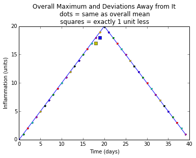
    plt.title(
        "Overall Maximum and Deviations Away from It\n"
        "dots = same as overall mean\n"
        "squares = exactly 1 unit less")
    plt.xlabel("Time (days)")
    plt.ylabel("Inflammation (units)")
    plt.show()
We have made some more refinements to our original algorithm:
- First, we focus only on the maximum values, so we only take the second element returned by our
analyze_stats()function (via the[1]index). - Second, we set the size of our loops based on the shape of
datamax. - Third, we improve the labeling and annotation of our plot.
sherlock(glob.glob('inflammation*.csv'))


