
EOAS Python - Plotting Maps
Learning Goals
- List variables in a MATLAB formatted data file
- Read MATLAB formatted data files into Python data structures
- Create plots using
axesobjects and set various axes attributes - Annotate plots with text, markers, and arrows
- Save plots to image files
Getting the Data
Inspecting and Reading .mat Files
The scipy.io module contains methods for inspecting MATLAB formatted data (.mat) files, reading them into NumPy data structures, and saving NumPy arrays as .mat files.
import numpy as np
import matplotlib.pyplot as plt
import scipy.io as sio

%matplotlib inline
Let's explore the Pacific Northwest coastline polygons file that Rich created from BC provincial and WA state data. Listing the variables in the file:
sio.whosmat('PNW.mat')
[('k', (13914, 1), 'double'),
 ('Area', (1, 13913), 'double'),
 ('ncst', (1470658, 2), 'double'),
 ('data_source', (16,), 'char')]
and loading the file into a Python varible:
pnw = sio.loadmat('PNW.mat')
Now let's see what the data looks like.
Caution Doing this can return a lot of output if the file is not as nicely structured as this one.
pnw
{'Area': array([[  3.16521920e+01,   3.95526325e+00,   1.12423973e+01, ...,
           4.44114418e-09,   4.03697403e-09,   6.50091288e-09]]),
 '__globals__': [],
 '__header__': 'MATLAB 5.0 MAT-file, Platform: GLNXA64, Created on: Tue Sep 23 21:31:54 2014',
 '__version__': '1.0',
 'data_source': array([u'The Pacific North-West coastline in PNW.mat was created from   ',
        u'two sources:                                                   ',
        u' a) BC Freshwater Atlas Coastline (FWCSTLNSSP) available as an ',
        u'    Arcview shapefile from GeoBC, and                          ',
        u' b) WA Marine Shorelines (shore_arc), available as a shapefile ',
        u'    on a lambert conformal projection from WA State Dept. of   ',
        u'    Ecology.                                                   ',
        u'                                                               ',
        u' The WA coastline was converted to lat/long using m_map and    ',
        u' all island arcs were then joined into continous oriented      ',
        u' polygons, and the coastline itself was converted into a       ',
        u' polygon by the addition of inland corners.                    ',
        u'                                                               ',
        u' The result is (supposedly) on the NAD83 horizontal datum      ',
        u'    - Rich Pawlowicz (rich@eos.ubc.ca)                         ',
        u'      July/2013                                                '],
       dtype='<U63'),
 'k': array([[      1],
        [ 396666],
        [ 639200],
        ...,
        [1470648],
        [1470653],
        [1470658]], dtype=int32),
 'ncst': array([[          nan,           nan],
        [-127.63646203,   52.0126776 ],
        [-120.        ,   52.0126    ],
        ...,
        [-127.59785952,   50.09807875],
        [-127.59789159,   50.09793491],
        [          nan,           nan]])}
Plotting Maps
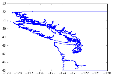
The ncst variable is a 2-column collection of NaN-separated line segments that make polygons for the BC/WA coast. The line segment end points are given in longitude/latitude pairs that we can easily extract into a pair of NumPy arrays:
lats = pnw['ncst'][:, 1]
lons = pnw['ncst'][:, 0]
and plot:
plt.plot(lons, lats)
plt.show()
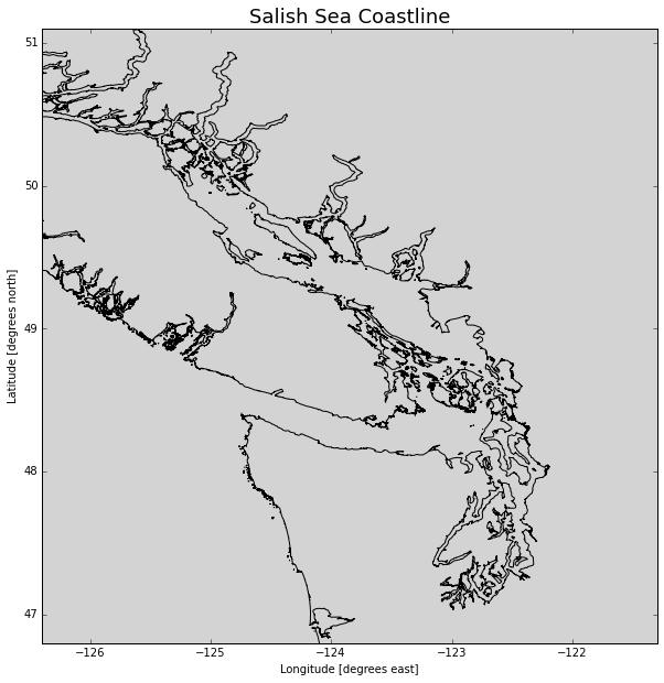
To really take control of plots we need to start working with axes objects. Here we will:
- Create a larger (10 x 10) figure with 1 axes
- Plot the coastline in black on the axes
- Use rasterization to reduce the number of points plotted so its faster
- Set the background colour to a light grey shade
- Set the axes limits to zoom in to the Salish Sea
- Add axes titles
- Add a title to the axis in a larger font size
fig, ax = plt.subplots(1, 1, figsize=(10, 10))
ax.plot(lons, lats, color='black', rasterized=True)
ax.set_axis_bgcolor('lightgrey')
ax.set_xlim([-126.4, -121.3])
ax.set_ylim([46.8, 51.1])
ax.set_xlabel('Longitude [degrees east]')
ax.set_ylabel('Latitude [degrees north]')
ax.set_title('Salish Sea Coastline', fontsize=18)
plt.show()
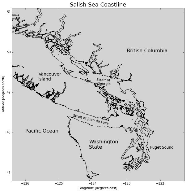
Now, let's add some annotations:
fig, ax = plt.subplots(1, 1, figsize=(10, 10))
ax.plot(lons, lats, color='black', rasterized=True)
ax.set_axis_bgcolor('lightgrey')
ax.set_xlim([-126.4, -121.3])
ax.set_ylim([46.8, 51.1])
ax.set_xlabel('Longitude [degrees east]')
ax.set_ylabel('Latitude [degrees north]')
ax.set_title('Salish Sea Coastline', fontsize=18)
# Annotate geography
ax.text(-126, 48,'Pacific Ocean', fontsize=16)
ax.text(-124.1, 47.6,'Washington\nState', fontsize=16)
ax.text(-122.3, 47.6,'Puget Sound', fontsize=12)
ax.text(-125.6, 49.3,'Vancouver\nIsland', fontsize=14)
ax.text(-123, 50,'British Columbia', fontsize=16)
ax.text(-124.6, 48.4,'Strait of Juan de Fuca', fontsize=11, rotation=-13)
ax.text(-123.9, 49.2,'Strait of\n Georgia', fontsize=11, rotation=-2)
plt.show()
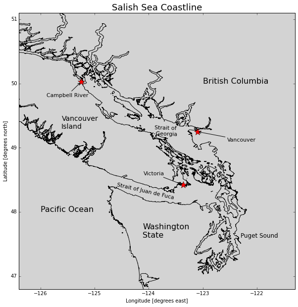
Mark some of the important cities and annotate them with arrows and labels:
fig, ax = plt.subplots(1, 1, figsize=(10, 10))
ax.plot(lons, lats, color='black', rasterized=True)
ax.set_axis_bgcolor('lightgrey')
ax.set_xlim([-126.4, -121.3])
ax.set_ylim([46.8, 51.1])
ax.set_xlabel('Longitude [degrees east]')
ax.set_ylabel('Latitude [degrees north]')
ax.set_title('Salish Sea Coastline', fontsize=18)
# Annotate geography
ax.text(-126, 48,'Pacific Ocean', fontsize=16)
ax.text(-124.1, 47.6,'Washington\nState', fontsize=16)
ax.text(-122.3, 47.6,'Puget Sound', fontsize=12)
ax.text(-125.6, 49.3,'Vancouver\nIsland', fontsize=14)
ax.text(-123, 50,'British Columbia', fontsize=16)
ax.text(-124.6, 48.4,'Strait of Juan de Fuca', fontsize=11, rotation=-13)
ax.text(-123.9, 49.2,'Strait of\n Georgia', fontsize=11, rotation=-2)
# Mark cities
cities = (
    ('Victoria', -123.3657, 48.4222, -80, 20),
    ('Vancouver', -123.1, 49.25, 60, -20),
    ('Campbell River', -125.2475, 50.0244, -70, -30),
)
arrow_properties = {
    'arrowstyle': '->',
    'connectionstyle': 'arc3, rad=0',
}
for name, lon, lat, textx, texty in cities:
    ax.plot(lon, lat, marker='*', color='red', markersize=15)
    ax.annotate(
        name, xy=(lon, lat), xytext=(textx, texty),
        textcoords='offset points', fontsize=11,
        arrowprops=arrow_properties,
    )
plt.show()
We can save our plot to an image file with the savefig() method of the figure object. Many image formats are supported, but if you can't decide, PNG is a good choice.
fig.savefig('SalishSeaGeography.png')
Plotting Colourmaps and Contours
The coastline data above is strictly 2-dimensional. If we also have depth and/or altitude data we show that dimension via colourmaps and contour lines.
Jody Klymak at UVic has created a .mat file of the southern Vancouver Island coastal shelf region from the Cascadia bathymetry/topography dataset.
sio.whosmat('SouthVIgrid.mat')
[('SouthVIgrid', (1, 1), 'struct')]
svi = sio.loadmat('SouthVIgrid.mat')
The file structure is a little more compicated than Rich's PNW file, so we'll just use some code that Jody provided to extract the lats, lons, and elevations.
topo_struct = svi['SouthVIgrid']
topo = topo_struct[0,0]
xmask = np.where(
    np.logical_and(
        np.squeeze(topo['lon'] > -126.7),
        np.squeeze(topo['lon'] < -122)))[0]
ymask = np.where(
    np.logical_and(
        np.squeeze(topo['lat'] > 46),
        np.squeeze(topo['lat'] < 50)))[0]
x = np.squeeze(topo['lon'])[xmask]
y = np.squeeze(topo['lat'])[ymask]
z = topo['depth'][ymask, :][:, xmask]